
Fashion Collection Mood Board: A Step-by-Step Guide

What if the best fashion mood board had fewer images but gave your team more direction? If your references feel scattered or the collection’s mood is hard to explain, you’re not alone. Creating a mood board for a fashion collection isn’t just about gathering inspiring visuals. It’s about choosing references with purpose and connecting them into a clear design direction.
This guide shows you how to build a cohesive board that communicates the collection concept before development begins. You’ll learn how to define a focused theme, select and organize references, and translate them into practical cues for color, fabric, print, and silhouette. The result should be more than an attractive collage: it should help collaborators understand what belongs in the collection, what doesn’t, and why. Follow the process from the first concept decisions through to a final board that supports productive development conversations.
Table of Contents
What Is a Fashion Collection Mood Board, and What Should It Clarify?
Choose Images, Colors, Textures, and Silhouettes That Tell One Story
Select the Right References: Digital, Physical, and Source Images
How to Create a Fashion Collection Mood Board in Five Clear Steps
Turn the Mood Board into a Useful Collection-Development Handoff
What Is a Fashion Collection Mood Board, and What Should It Clarify?
A fashion collection mood board is a curated set of visual references that communicates a collection’s intended direction. It gives designers and collaborators a shared starting point before sketches, samples, and production details take shape. The board can be physical or digital, but its purpose is the same: make the concept easier to see, discuss, and refine. For a general overview of the format, see What is a Mood Board?
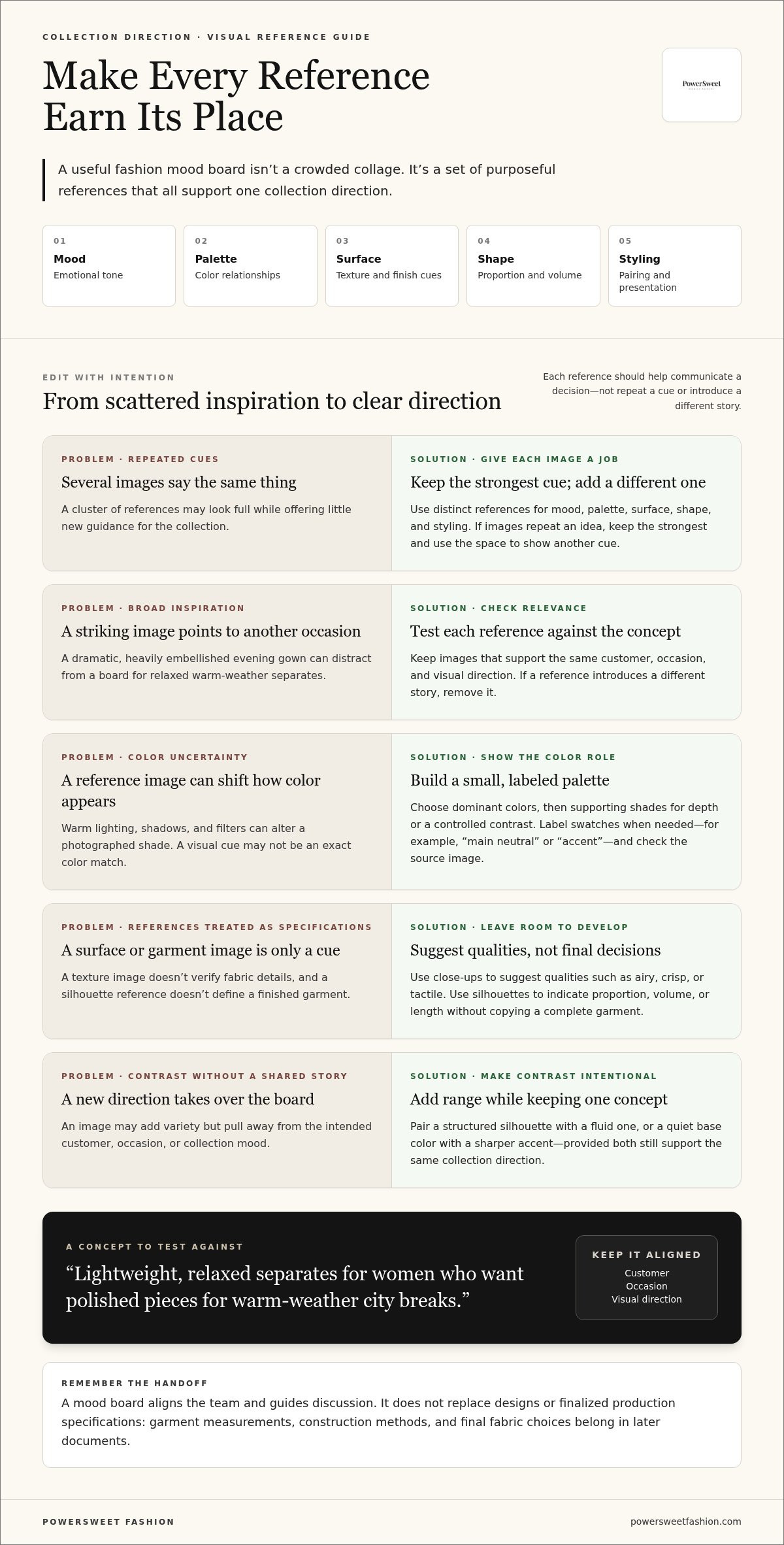
Think of the board as an alignment tool, not a finished design plan. It should clarify the collection’s mood, intended customer, season, silhouette, color, and material direction. References can suggest a shape, surface, or finish, but they don’t specify garment measurements, construction methods, or final fabric choices. Those decisions belong in later design and production documents.
A focused board helps the team respond to one clear direction instead of interpreting a loose set of images in different ways. Before adding a reference, ask what decision it could help inform. If it looks appealing but doesn’t support the concept, it may create confusion rather than add value. That distinction is central to creating a mood board for a fashion collection that can guide development conversations.
What decisions should a fashion mood board help you make?
Start with a short concept statement that names the customer and occasion. For example: “Lightweight, relaxed separates for women who want polished pieces for warm-weather city breaks.” Use it to test every reference: does this image help express the customer, use, or feel of the collection?
Next, establish a consistent emotional tone. A sun-faded building, softly rumpled linen, and an easy, unstructured silhouette could all support a relaxed direction. Use images to suggest possibilities, not lock in final designs. They can signal a palette, shape, texture, or detail worth exploring while leaving room for decisions during development.
How is a collection mood board different from a trend collage?
A trend collage gathers ideas around a broad subject, such as a color, material, or seasonal mood. A collection-led board has a narrower purpose: it supports one specific design concept and helps determine what belongs in that collection. Each reference should reinforce the same customer, occasion, and visual direction, rather than simply reflect what’s attracting attention.
Apply a relevance check before keeping an image. Imagine a board for relaxed warm-weather separates. A dramatic, heavily embellished evening gown might be striking, but if it points to a different occasion and level of formality, remove it. Editing is part of the design work. A smaller selection with a clear purpose gives collaborators stronger direction than a crowded collage of unrelated inspiration.
Choose Images, Colors, Textures, and Silhouettes That Tell One Story
Give every reference a clear role. One image can establish the emotional tone, while another indicates a color relationship, surface quality, proportion, or styling approach. If several pictures communicate the same idea, keep the strongest and use the space to show a different design cue. The goal is to make the board more useful for collection decisions, not simply more visually varied.
Visual coherence means every reference reinforces one identifiable design direction, even when the images show different subjects or forms. For a women’s work-to-evening collection, architectural lines might suggest clean structure, a muted palette could set the tone, and a draped garment reference might hint at movement. The pictures don’t need to match literally. They need to support the same idea.
Mood: Communicate the emotional register, such as crisp, soft, functional, or expressive.
Palette: Show the relationship between the main colors and supporting accents.
Surface: Suggest qualities such as smooth, nubby, sheer, or softly crinkled.
Shape: Indicate proportions, volume, and how garments might sit on the body.
Styling: Set a direction for how pieces could be paired and presented.
Contrast can add range without breaking the concept. Pair a structured silhouette with a fluid one, or a quiet base color with a sharper accent. Keep the contrast intentional: both references should still make sense for the same customer, occasion, and collection mood. If an image introduces a new direction instead of adding nuance, it’s probably distracting from the story.
Build a palette that supports the collection concept
Choose a small group of dominant colors, then add supporting shades for depth or a controlled point of contrast. Label swatches when their role isn’t obvious, for example, “main neutral” or “accent.” Check the source image before settling on a color: warm lighting, shadows, and filters can alter how a shade appears. A photographed fabric or painted wall can offer a useful cue, but it may not show an exact color match.
Use texture and silhouette references without overdesigning
Use close-up surface images to communicate visual qualities such as airy, crisp, or tactile. Treat them as creative cues, not verified fabric specifications. Silhouette references can suggest proportion, volume, or length without requiring you to copy a complete garment. Balance detailed clothing images with broader references, such as folds, shapes, or architectural forms. This leaves room for design interpretation as the collection develops.
Once the board points to a material direction, fabric sourcing for women’s clothing can help connect the visual references with material exploration. Clear cues make those development discussions more focused.
Select the Right References: Digital, Physical, and Source Images
The right format depends on how you develop ideas and share them. Physical boards make it easy to compare printed references with real fabric or trim. Digital boards are easier to rearrange, revise, and share with collaborators. Either can support creating a mood board for a fashion collection, as long as references stay organized and each one has a clear purpose.
Build your source pool with a specific question in mind. Photography can communicate mood, styling, or proportion. Art can inform color relationships and visual rhythm, while architecture may suggest lines, structure, or balance. Nature can offer cues for color and surface. Vintage references can help you explore a period or detail, and fabric or trim samples bring tactile qualities into the discussion. Record where each reference came from, along with any usage permissions or licensing details. Images found online aren’t automatically cleared for external presentations or publication. Use material you created, public-domain or licensed images, or references you have permission to share.
Choose a format that fits your workflow rather than a particular platform. Consider whether you need hands-on material comparison, frequent edits, remote feedback, or a polished presentation. A simple file or board tool is enough if it lets you arrange, label, and update references clearly.
When does a physical mood board work best?
A physical board is useful when scale and touch matter. Place a fabric swatch beside a printed texture reference, or compare trims directly with the palette. This makes material relationships easier to assess in person. The trade-off is flexibility: changing the layout takes more effort, and remote collaborators may not see updates as they happen. Photograph the final arrangement in even light so everyone can refer to the same version later.
When is a digital fashion mood board more useful?
Digital boards make it simple to move elements, test visual hierarchy, and remove references that weaken the direction. Sharing one current version gives collaborators a common place to review and comment, rather than scattering feedback across separate files. Templates such as those available through Milanote are one option, but the best tool is the one that suits your team’s editing and sharing habits.
Whichever format you choose, maintain a source log beside the board. Include the creator or source, a link or identifying note, and permission or license status when relevant. This keeps references traceable as the board moves from private exploration into team presentations. For physical samples, note what each swatch or trim is meant to communicate, such as weight, surface, or color impression, without treating it as a finalized material specification.
These source details can also make later fabric discussions more focused. Fabric and trim sourcing for women’s clothing can connect visual references with material exploration during collection development.
How to Create a Fashion Collection Mood Board in Five Clear Steps
A reliable workflow keeps the board connected to the collection brief from the first reference to the final edit. Creating a mood board for a fashion collection means making focused decisions, not just filling a page. Move on when each step produces something useful for the next one.
Start with a short concept brief before collecting images
Write one concise statement naming the intended customer, occasion, mood, and collection direction. Then set a few questions the board needs to answer: What should the proportions feel like? Which colors establish the main tone? What surface qualities support the concept? Use these questions to filter references across photography, art, architecture, nature, and material samples. Output: a brief and a short set of visual questions.
Define the brief. Describe the collection in practical terms, including who it serves, when the pieces are worn, and the mood they should convey. Avoid vague phrases that could point in several directions. Output: one focused concept statement.
Gather references. Collect images and material cues that respond to the brief’s questions. Keep a temporary pool, but record each reference’s source so you can trace it later. Don’t arrange every image as soon as you find it. Output: a labeled reference pool.
Group by cue. Sort references into roles such as atmosphere, palette, silhouette, texture, and styling. This reveals whether a design cue is missing or several images repeat the same message. Output: clear groups with a distinct purpose for each.
Compose the board. Choose a few anchor references to establish the direction, then use supporting visuals to add detail. Arrange the groups so the eye can move between the overall mood and specific design cues. Output: a first complete layout.
Review and refine. Remove duplicates and references that don’t support the brief. Check whether the palette, shapes, surfaces, and styling work together, then ask someone unfamiliar with the process what collection direction they see. Output: a coherent board that communicates without a lengthy explanation.
Arrange, edit, and test the board for clarity
Give the board a clear hierarchy. One or two strong anchor references can establish the overall feel, while smaller supporting visuals clarify palette, silhouette, or surface. Keep labels short and specific so they guide discussion without turning the board into a specification sheet. During review, listen for what the viewer notices first. If they describe a different mood or customer than the brief, adjust the references or their order before sharing the board more widely.
Define the concept, gather with purpose, group the cues, compose the layout, then check that the whole board reads as one direction. Once the visuals are ready to inform development, women’s clothing sample development can help test design ideas in garment form.
Turn the Mood Board into a Useful Collection-Development Handoff
A mood board sets creative direction, but it isn’t a tech pack or a set of finalized production specifications. Its role is to help the development team understand the visual intent behind the collection. As creating a mood board for a fashion collection moves into the next phase, pair it with written garment descriptions and technical information as those details become available. This turns inspiration into a useful discussion without asking a reference image to answer questions it was never meant to settle.
What should accompany the mood board in a design handoff?
Add concise annotations beside key references. Identify what each image is intended to communicate, and separate confirmed decisions from ideas that still need exploration. For example, a color swatch may show an agreed palette direction, while a photograph of a draped garment may inspire a shape without instructing the team to reproduce that design.
Keep notes practical and easy to scan. A handoff might include:
Palette: Which references guide the main colors and accents.
Silhouette: Which images suggest proportion, length, or volume.
Texture: What surface quality or tactile impression to explore.
Finishing: Which references inform details such as closures, trims, or overall finish.
List open questions separately from agreed direction. Mark whether a material is selected or still a visual reference, and flag design details that need review during development. This reduces the risk of collaborators treating an inspirational image as a precise construction instruction. Develop and document written garment descriptions, measurements, construction details, and other technical requirements through the appropriate design and production stages.
How can sampling and sourcing carry the visual direction forward?
Once the handoff explains what the board means, fabric and trim sourcing can explore materials that support its visual direction. A reference suggesting a crisp surface, for instance, can prompt a material discussion, but the image itself doesn’t establish a fabric specification. Sampling and fitting then help assess how a garment’s material, shape, and details work together beyond the flat visual reference.
These are development stages, not automatic outcomes of making a board. The concept still needs garment-specific decisions and review. For a closer look at how samples support design refinement, read this sample development guide. To understand how the creative handoff fits within the wider workflow, see the end-to-end clothing production guide.
A clear handoff gives everyone a shared visual reference and a transparent record of what’s decided, what’s still open, and what needs to be developed next.
Move Your Collection Concept into Development
A mood board becomes more valuable when it leads to clear next steps. Use it to start a focused conversation about which visual cues should guide material exploration, garment shapes, and sample decisions. Keep the distinction between inspiration and confirmed specifications visible as the collection develops. That way, the creative direction stays intact while practical details are tested and refined.
Creating a mood board for a fashion collection is an early step toward building a shared vision. PowerSweet Fashion provides women’s clothing production, including fabric and trim sourcing, patternmaking and grading, sampling and fitting, and bulk production and finishing. Its production service also covers labels, tags, and packaging, with multi-step quality control on every production run. Sample production has a 5-7 day turnaround, and bulk production has a 15-25 day turnaround. Minimum orders are as low as 50 pieces per style and color, with size variations.
Explore PowerSweet Fashion’s women’s clothing production services and take the next step toward developing your collection. Share your concept and garment requirements to start a focused production conversation.
Frequently Asked Questions
How many images should a fashion collection mood board include?
There’s no fixed image count. Include enough references to make the collection direction clear without forcing collaborators to decode a crowded page. A practical test is whether a viewer can identify the customer, mood, palette, and garment direction at a glance. If removing an image changes none of those signals, leave it out. Keep extra research in a separate archive so the working board stays easy to review.
What should be included in a fashion mood board?
Include material that helps someone make or evaluate a design choice: a short concept note, representative garment or proportion references, color cues, surface details, and styling context. Add brief labels to explain what each reference contributes. For example, note whether a photo informs sleeve volume or only the overall attitude. When creating a mood board for a fashion collection, avoid adding visuals solely because they look attractive.
Can I create a fashion mood board without design software?
Yes. You can make a useful board with paper, printed or hand-drawn references, colored paper, and real swatches. Arrange the materials by purpose, write short labels by hand, and keep a phone photo or scanned copy as the shared record. The key isn’t the software; it’s whether someone else can understand the visual cues and tell which ideas are settled versus still exploratory.
What is the difference between a mood board and a fashion tech pack?
A mood board communicates intended visual direction; a tech pack documents garment details for development and manufacturing. A tech pack may include technical flats, measurements, construction notes, materials, trims, and labeling information, depending on the design. For instance, a board can suggest a clean finish, while the tech pack must state the chosen finish and how it’s applied. Keep the documents complementary, not interchangeable.
How do I keep my fashion mood board from looking cluttered?
Start with a single page or screen and set aside a clear area for each visual role. Use consistent sizes for supporting references, reserve the largest space for the central idea, and keep labels short. Then view the board as a small thumbnail: competing focal points and tiny details become obvious. Move secondary research off the main board rather than shrinking everything until the layout feels compressed.
Can I use images from the internet on a fashion mood board?
Use online images in boards shared externally or published only when you have permission or an appropriate license. An image appearing in Google results, Pinterest, or a social post isn’t automatically cleared for commercial use, and credit alone doesn’t replace permission. For a client presentation or portfolio, choose licensed stock, public-domain material, original visuals, or content its creator has authorized for that use. Keep source and permission records with the project.
Does a mood board replace sketches or a tech pack?
No. A mood board gives creative context, sketches develop that direction into proposed garment forms, and a tech pack records specifications needed for production. A board might point toward a boxy jacket with a soft hand; a sketch shows the intended cut, while technical documents clarify measurements, construction, and selected materials. Use each at the stage it serves, so visual inspiration doesn’t have to carry production instructions.
Comments